Generate Spread Curves
Spread curves apply the pattern of a demand factor (for example, seasonality, decay, life cycle, and region) to a new-product forecast. Based on historical data, your forecast is spread based on the demand factors you apply.
Spread curves are helpful when, for example, you have a new item with no historical data. You can select the likely demand effects that affect the new product and apply the effect to the forecast. Effects can include seasonality, decay, launch time, life cycle, region, and more.
You can generate and save spread curves to use in Spread Curve records.
See Spread Curve Record.
To generate a spread curve
- In a workflow, click the Spread Curve Generator task.
- At the top of the main screen, click the Record Filter icon and select the parameters to include in your spread curve.
Spread Curve Filter
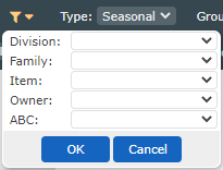
You can select multiple parameter options. 3. From the Type list, select one of the following:
Spread Curve Setup Options
| Option | Description |
|---|---|
| Lifecycle | You set the number of periods in the spread curve, the curve continues indefinitely or until the curve goes to zero (is no longer sold). The lifecycle options pulls in the history of every item for as many periods as you set in step 5. If there is a new product launch, then it is a new beginning of history. For every item, the system looks at the first year, regardless of when it launched. This shows you the launch effects (for example, a spike and then it levels out). There may be a seasonal effect built in if the items in your selected group launched at approximately the same time of the year. |
| Seasonal | Each period shows the percent that period contributed to the total for the year. For example, a value of 0.15 means 15% of the sales for the year happened during that period. Each period in a Seasonal spread curve represents that period in the year. For example, period 1 is January and period 12 is December in a monthly system. Seasonal curves align the history of your items based on the time of the year in each period. The number of periods for a seasonal curve is determined by your system (weekly or monthly, for example). The multiplier seasonal curves indicate an amount above or below normal in each period, where a normal period is equal to 1. This hovering around 1 makes the multiplier curve work well (that is, simpler scale factor) with a lifecycle curve based on the average amount in each period since the values are multiplied. |
| 4. From the Group data by list, select how you want to group your results based on the attribute. |
Group Data
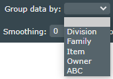
This options allows you to do some analysis based on scale.
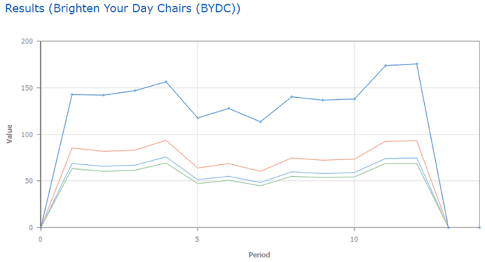
Note: If you select Location Region in this list, it displays each region's associated data.
Spread Curve with Location Region Option
 5. If you selected a Lifecycle type in step 3, at the top of the screen, do the following:
Lifecyle Setup Options
| Option | Procedure |
|---|---|
| Periods | Type the number of periods to include. For example, this could be 12 for the 12 months of a year or maybe 26 because the lifecycle of a product is 26 weeks. |
| Align data to | How the start of history of each item is determined. The first data point assumes the first period to be the first non-zero historical data point. Use the first significant point options when you have a soft launch or partial month in the first period(s). The threshold values in parentheses represent the amount the initial period(s) must reach (out of the total for the curve) to be included as an actual historical data point. For example, if you have 4 units sold in the first month, and 234 units sold in the second, and you do not consider the 4 units in the first month to be valid, you can select the smallest threshold value that eliminates that data point. If your total over the number of periods selected is 3015, and you select the >1.0% threshold, the first value must be at least 1.0% of that total (30) to be included. The higher the threshold, the more data points are excluded. Some experimentation is likely necessary to pick the correct threshold for your data. Look at individual records in the bottom table to review the history of individual items and investigate what may or may not have been excluded. |
| 6. At the top of the screen, do the following: |
Spread Curve Setup Options
| Option | Procedure |
|---|---|
| Weighted data by | Select one of the following: - None: Raw average of the historical data for each data point (for example, sales). This is a weighted average. You typically use this option. - Normalize: Extracts the shape of the historical data of each item to generate the curve making each item equal weight in its contribution to the shape. This produces a different curve than the weighted average, where top-selling items dominate the shape. Each period is shown as a percentage that period contributed to the total. If you select this option, you must set the Scale in a Spread Curve record much higher since each period is a percentage rather than an average. See Spread Curve Record. - Any remaining options are numeric fields in your instance. Weight Data Groups |
| Smoothing | Type a value from 0 (no smoothing) to 1 to add levels of smoothing to your curve. |
| Show traces | Check this option to show spread curves on the graph for a distribution of records. This provides a sanity check to ensure your grouping is behaving the way you expected. |
7. Click the Recalculate icon ( ). ). |
The Spread Curve Data table shows the number of Periods, the Starting Value used, a writable Overrides row, and the color-coded rows shown in the Results graph.
Spread Curve Data Table
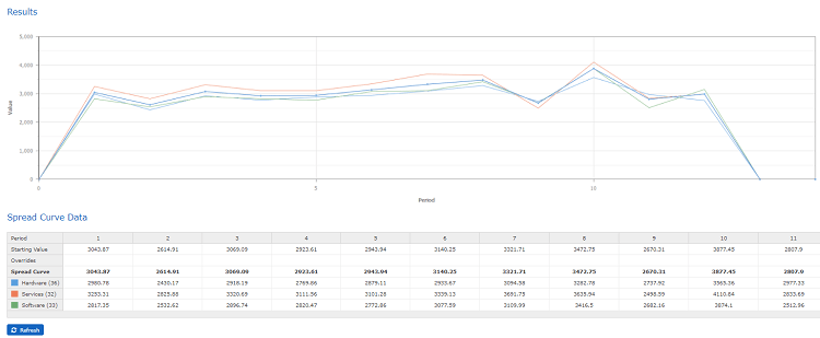 8. In the Spread Curve Data table, add any overrides you want to include.
9. If you have a normalized or seasonal curve, on the menu (
8. In the Spread Curve Data table, add any overrides you want to include.
9. If you have a normalized or seasonal curve, on the menu ( ), select Normalize or Divide by average option to
correct the total after you apply any overrides.
10. The Records Used table shows the records used to create the results. To exclude any
items, click the check box to the left of the item to exclude and click Exclude Checked.
), select Normalize or Divide by average option to
correct the total after you apply any overrides.
10. The Records Used table shows the records used to create the results. To exclude any
items, click the check box to the left of the item to exclude and click Exclude Checked.
To include items you have excluded, click **Clear Exclusions**.

The Records Used table also shows the Correlation column. This column indicates how well
that specific record fits with the overall analysis shown in the Results graph. It
uses up to 1. One means the record matches perfectly with the results. Less than one means it does not match perfectly.
-
To save your spread curve, on the menu (
), do the following:- Click Save Spread Curve.
- In the Save As screen, in the File name text box, type a name for the curve.
-
On the Share type drop-down list, select one of the following:
-
Private: Available for use by others, but only the creator can edit the spread curve.
- Public: All users can view and use the spread curve, but they cannot edit it.
- Click Save.
- To open a spread curve you have saved, on the menu, click Load Spread Curve.