About Analysis Graphs
Analysis graphs help you assess the fit between a forecast method and your historical data by showing everything that was not modeled by the chosen forecast method. Ideally, you find no discernible pattern in the analysis versus time graph, and the distribution graph looks like a standard bell curve centered near zero.
Analysis Graph
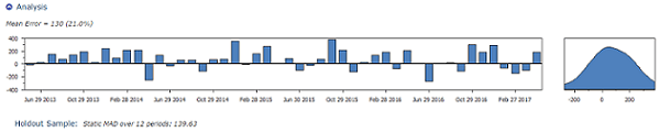
Analysis Graph Definitions
| Term | Description |
|---|---|
| Mean Error | The fit between the forecast method and historical data is expressed as a Mean Absolute Deviation (MAD) and a Symmetric Mean Absolute Percent Error (SMAPE). In the case of a time-series forecast, this error is the difference between the one-period-forward forecast and historical actuals. Usually selecting a method that reduces the error improves your forecast, but this is not always true. The Forecast Engine may select a method that does not produce the best fit to historical data, but does produce the most reliable forecast. |
| Holdout Sample | The Holdout Sample displays the mean error over the last 12 periods of the forecast. It is an unbiased evaluation of how well the forecast method matches the historical data over the last 12 periods. The system dynamically calculates the holdout sample for each record based on data points, seasonality, etc. It can then create a holdout period. The purpose of the holdout sample is to evaluate the forecast while ignoring any bias that may have been introduced by filters and methods that allow for greater forecast flexibility. However, the Holdout Sample is anecdotal because it is only sampling the last 12 periods of historical data. |
Look for the following items to help you improve your forecast:
Analysis Graph Trends
| Trend | Description |
|---|---|
| Analysis vs. time graph | - A recurring pattern on annual, weekly, or other calendar boundaries indicates an unmodeled seasonal pattern. - If there is another recurring pattern, then your data might include the effects of recurring promotions, price changes, or other events you should include as adjustments. - A "u" or "n" shaped trend indicates your data contains exponential growth or decay, but it is being forecast with a linear trend. |
| Analysis distribution graph | - If the peak is not centered above zero, your data contains a growing or declining trend, but it is modeled with a level method; or, your data contains exponential growth, but it is modeled with a linear trend method. - If the curve is not bell shaped, you may have too little historical data to create a smooth distribution graph. This can be ignored. - If you have a large amount of data, and the curve is not bell shaped, there may be a structural change in the underlying process forecast (for example, changes in promotion, distribution, competition, etc.). Using only the most recent historical data or including adjustments might improve the forecast. |
See Analysis Section.