Configuration window structure
Introduction
Several configuration windows are used in the creation of forms, and they have a structure similar to the one described below.
What it looks like
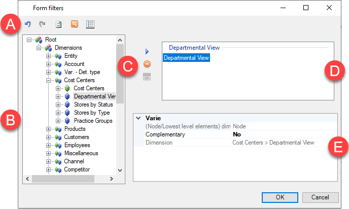
| Element | Description |
|---|---|
| A | Action buttons |
| B | Dimensions tree |
| C | Buttons to manage dimensions in the definition area |
| D | Definition area |
| E | Table of properties of the selected element in the definition area |
Action buttons
There are various buttons depending on the type of page and user. Below is a list of frequently-used buttons:
| Element | Description |
|---|---|
| Undo the last action. | |
| Repeat the last action. | |
| Refresh the dimensions tree. | |
| Allows you to search the dimensions tree. | |
| Allows the user to select the display mode for forms on the panel: with description only, with code only or with both description and code. |
Dimensions tree
The dimensions tree shows the available dimensions organised into levels of nested nodes.
Note: elements identified as N.A. are specific elements not related to any node, but available for reporting.
| Level | Element | Description |
|---|---|---|
| Node type | Financial dimensions node | |
| Analytical Workspaces measures node | ||
| Node dimensions | Dimensions for which aggregation structures can be defined | |
| Dimensions for which aggregation structures cannot be defined | ||
| Dimensions content type | Aggregation structures | |
| Time-dependent hierarchies | ||
| Elements of the dimension | ||
| Elements of the dimension | Element of the dimension |
For time-dependent hierarchies, the dimensions tree does not show the lowest level elements of the nodes, namely the specific elements to which the hierarchy refers, because the relationships of the lowest level elements the first hierarchical level depends on the scenario/period. To make it easier to understand the elements related to nodes of time-dependent hierarchies, an N.A. node is displayed, under which all the elements of the dimension are listed and identified with the  icon.
icon.
Properties of the selected element
| Element | Description |
|---|---|
| Rows of properties | - Allows you to set the element’s properties. - When several elements are selected, the user can make changes en masse to the properties that the selected elements have in common. |
Properties table section
The content varies based on the selected dimension or filter. When multiple filters are selected, the table only displays the properties that the filters have in common, and allows you to manage these properties only.
| Element | Description |
|---|---|
| Group of properties related to the same aspect to be configured (e.g. the Hyperlink item enumerates all the properties related to hyperlinks). See Row/column filters. |
Shared behaviours
Regardless of the purpose of the specific window, configuration is generally done by moving a set of elements or nodes from the dimensions tree to the definition area.
Filters can be added using the buttons, or by dragging and dropping. Filters can also be added individually or by multiple selection, by holding down CTRL or SHIFT.
In windows in which it is possible to define the order of the element (the Tab Filters window, for example), the filters are shown in the same order in which they were selected in the dimensions tree.