About Forecast Graphs
A forecast graph contains data points for historical data and forecast data, and it displays the model and confidence interval for the forecast.
Forecast Graph
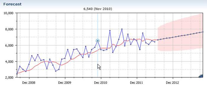
The forecast graph uses different lines to indicate different types of information. The following types of information are in the forecast graph:
Forecast Graphs
| Information | Description |
|---|---|
| Blue line | Actual historical data |
| Green line | Adjusted or comparable historical data |
| Red line | Forecast before applying adjustments and overrides (lead time demand) |
| Black line | Final forecast, including all adjustments and overrides |
| Pink band | 95% confidence interval You can reduce this band with more historical data to help determine trends. The confidence interval is determined using Monte Carlo simulation and other deep calculations (not simply standard deviation). |
| Round points | Historical data values on the blue line; Forecast values on the black line |
See Dock Graphs in Reports and Interfaces.
See Edit Graph Elements.